Brazilian institutions have a very low trust from the population. There are only two things that seem to be completely fool-proof in the country: revenue taxes and voting machines. There isn’t much we can do about the latter, but some people are saying that the election system is rigged.
One of the arguments is that the data fails statistical tests, that is, there are some expect trends for a large collection of data and the election results behave in a different way. As an example, these people bring forward Benford’s Law, but it seems that they are not interested in explaining it. They just name it as something important and move on.

Understanding the problem
So, what is Benford’s Law? According to Wikipedia [1]:
Benford’s law, also called the Newcomb–Benford law, the law of anomalous numbers, or the first-digit law, is an observation about the frequency distribution of leading digits in many real-life sets of numerical data. The law states that in many naturally occurring collections of numbers, the leading digit is likely to be small. In sets that obey the law, the number 1 appears as the leading significant digit about 30 % of the time, while 9 appears as the leading significant digit less than 5 % of the time. If the digits were distributed uniformly, they would each occur about 11.1 % of the time. Benford’s law also makes predictions about the distribution of second digits, third digits, digit combinations, and so on.
What does that mean? In summary: if we analyze only the first number of each item in a data set, we will see more occurrences of the lower numbers. It makes sense if we think about it a little.
Imagine the case where we want to draw a random number between 1 and 99. To find out what the chance of it starting with the digit 1, we have to list all those who are in that category (1, 10, 11, 12, 13, 14, 15, 16, 17, 18 and 19). There are 11 occurrences out of a total of 99 possibilities. That is, the chance is 1/9, as well as for any of the other digits.
In a case where we want to draw a number between 1 and 199, things change a lot. We have 111 occurrences for the digit 1, and only 11 for the others. That is, the chance of starting with 1 is much greater. If the limit is 299, we have more occurrences for 1 and 2, and so on.
In other words, for a large data set, a necessary condition for making statistical analysis, where the measured value goes through several orders of magnitude (tens, hundreds, thousands, for example), the chance that the first digit of the measure is small is greater than the chance that it will be large.
Available Data
The data for all Brazilian elections can be obtained from the TSE Electoral Data Repository page [2]. The total of each electoral zone is available on the link “Nominal vote by municipality and zone (ZIP format)”. For president, we’ve used as input only the file ending in ‘BR’. In this file, each line has the number AA of votes that candidate BB received in electoral zone CC, in city DD and state EE.
According to the TSE: “Candidate data and election results from 1994 to 2002 are incomplete. A review of the data sources is underway and, as work is completed, the files will be replaced.” It’s been this way since the 2018 elections…
Our intentions
After picking an election year and its round, we will process the data for each election zone in the country. The number of votes for each of the presidential candidates in each zone is what we want to evaluate. There are more than 80,000 zones, including those for people living abroad. We need to have statistical relevant data, so we are grouping them by state and region, and also a national count.
Our output is a large group of plots comparing the actual data with the predicted proportion given by Benford’s Law. For each presidential candidate, we have one plot for the country, one for every state and one for every region. It also presents how much the data deviates from the expected values.
We have two summary plots, showing the states or regions in the horizontal axis and the candidates in the vertical axis, colored by the deviation. This way we can identify other trends in the data.
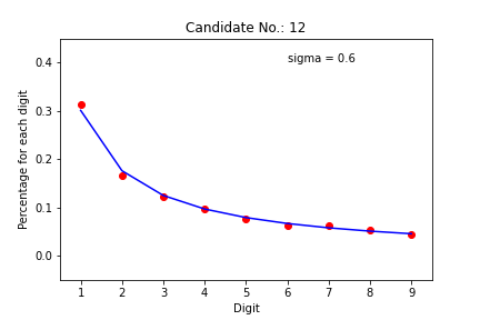
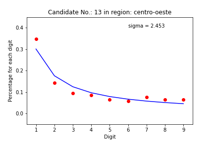
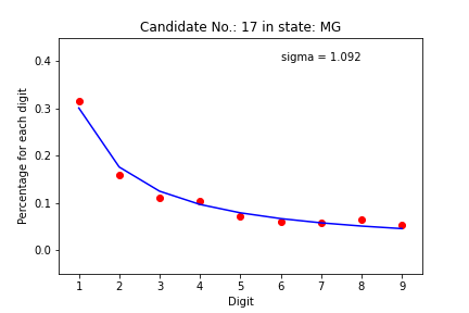
Example of outputs
Summary crossplots
There are too many plots to look. Let’s see what we can learn from the summary crossplots, one for the states and another for the regions. We color the graph by deviation from the expected value. If sigma is less than 3, the dot is blue. If between 3 and 6, it is green. If between 6 and 9, the dot is yellow. If greater than 9, the dot is red. So we can see how much each pair (candidate, state) came close to the mathematical model.
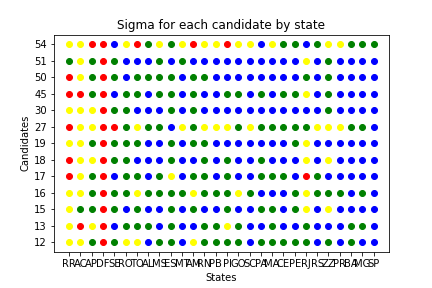
We can see the majority of points are blue and green. Let’s dive in to see what is happening in this plot.
Roraima, Acre, Amapá, Sergipe and the Federal District have results that are far from the ones predicted by the Benford’s Law. These are states with a small number of zones, which indicates that it may not be appropriate to apply these statistical tools.
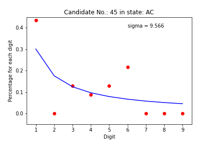
We have two candidates who have a considerable difference in most states. Party 27, Democracia Cristã, and Party 54, Pátria Livre, are new and with a low representation, which may indicate again that the statistics may be poor in these cases.
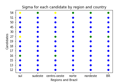
By grouping the information from the states, we see that the data really matches what was expected. Again, we have the cases of the two parties with low representation, 27 and 54. The third party that has non-blue points is the 16, PSTU, another one with a small following.
Final Conclusion: when we respect the premise that we have a large enough data set, we see that there is no evidence of deviations in the Brazilian electoral data.
Jupyter Notebook available at Github. Interactive panel at Tableau Public.